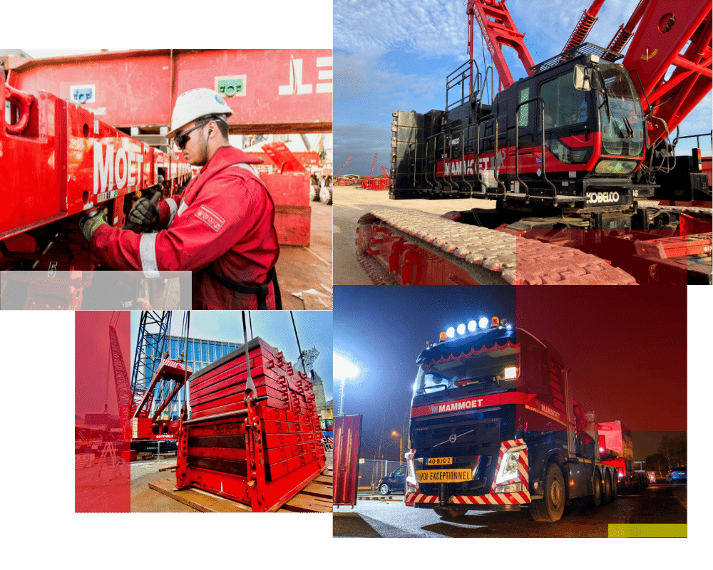
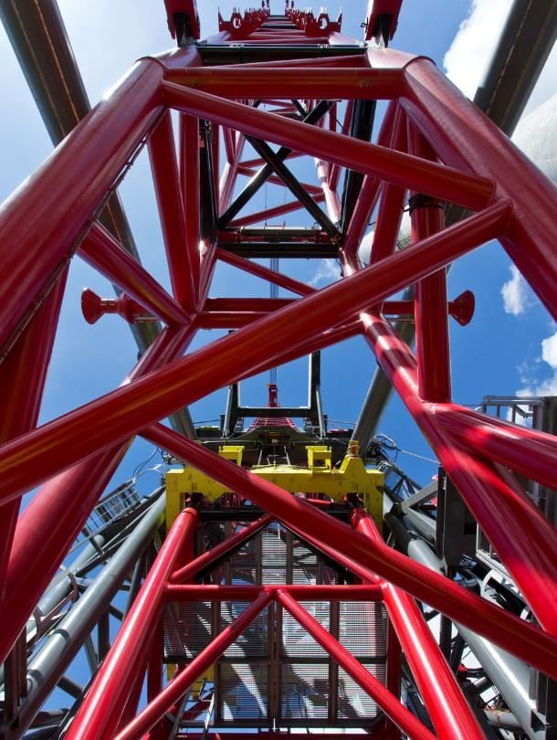
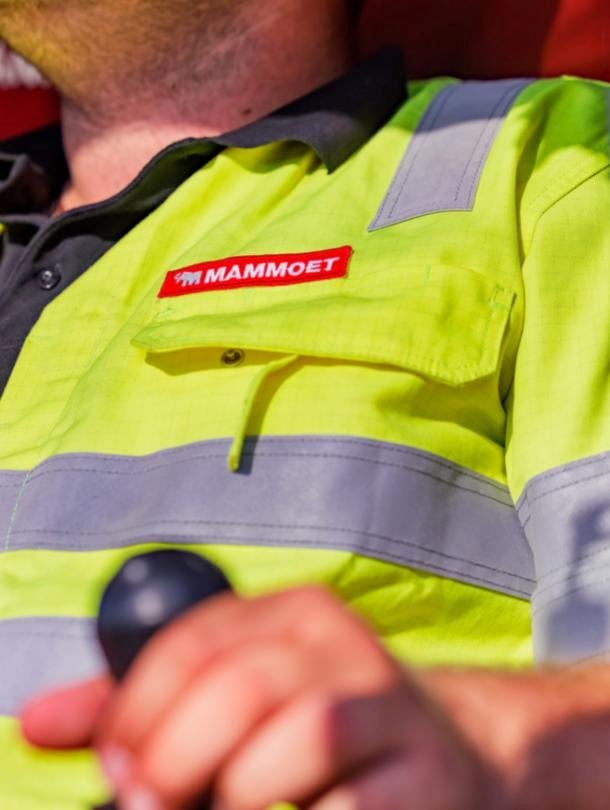
EQUIPMENT BRANDING MANUAL

This guideline ensures our visual identity is consistently applied across all equipment worldwide. It balances branding with operational needs and local adaptations, creating a unified image that reinforces our industry leadership.

This document is a comprehensive guide for applying Mammoet’s branding to equipment, vehicles, and support materials. It integrates operational standards and safety regulations, while maximizing brand exposure.

In case of questions, reach out to equipment.branding@mammoet.com.


Design Principles

Hero the strapline

Brand recognition lies not only in the logo but also in the distinctive strap. Mammoet’s recognizable strapline is used as effectively as possible to strengthen brand visibility. 

*The Mammoet logo is no longer incorporated into the strap. It has been separated, allowing it to be larger and more freely applied. The letters of the logo and strapline, are the same height. 

Bigger logo for maximum impact  

The logo is applied as large as possible while adhering to the specified margin guidelines. Increasing the logo size increases the strapline height. 

Embrace consistency 

There is only one direction of the Mammoet icon. Don’t use or apply the reversed Mammoet icon. Applying the logo in one way shows confidence and contributes to brand recognition. 

Visual assets

Logo colors 

A black or red background does not change the colors of the logo itself. Only a white background changes the color of the Mammoet icon and wordmark (see example). 

For the positioning of the logo see chapter; The design system. 

Alternative logo colors

Rental or leased equipment that is not painted in Mammoet house-style colors must always have a black logo applied without a red background.

Paint colors

Mammoet is red. and this color makes us an icon in the industry. Use it with pride. Black is the color of our canvas. Our paint is red. Details in white or Signal yellow. 

Foil colors

To maintain the right colors and foil types within Mammoet, use the standard foils wherever they are available. 

Typeface

The font used on the equipment for all applications is “Helvetica Neue LT Std”. 

We use the weight “95 Black” for: Equipment numbers, USDOT and addresses. 

The design system

Horizontal logo margins 

Minimal clearance options for logo application on equipment, transparent M’s solely used as measurement tool. Not to be applied onto equipment as part of its branding. 

PREFERRED MARGINS 

The margin around the logo must be equal to the letter 'M'. 

FALLBACK 1 (Optimal logo size) 

The margin around the logo must be equal to 2x the spacing 

between the Mammoet icon and the letter ‘M’. 

FALLBACK 2 (Minimal margins) 

- Always use option 1 or 2. If not possible, only then consider this option.

- Logo placement for non-standard proportions, and where the logo may be placed larger because it would otherwise be too small. 

- The margin around the logo must equal 1x the spacing between the Mammoet icon and the ‘M,’ except at the top (2x the spacing between the Mammoet icon and the ‘M’). 

Note: This variant is only used in exceptional cases, such as the SPMT. 

Vertical logo margins 

Proportions, margins and alignment details 

Always prioritize layouts where the horizontal logo fits well. If the design requires a square or vertical layout and the horizontal logo cannot be applied effectively or needs to be broken due to seams, use the vertical logo instead.  

PREFFERED LOGO 

The area for the sticker is horizontal, so the square logo is not used. 

FALLBACK LOGO 

The area for the sticker is vertical, so the landscape logo is not used.

Logo & strapline 

Positions of the logo on the strapline: 

- Place the logo at the rear of the vehicle (if not possible or for pragmatic reasons, other placement is allowed).

- The logo can be flexibly positioned across the width of the strapline.

Size and placement based on equipment height (1/24 grid) 

Align the strapline’s size and placement on the equipment as closely as possible to the 1/24 grid. If exact alignment isn’t practical, use your judgement to determine the most functional and legible position and size for the logo and strapline – but keep in mind consistency across similar types of equipment when you do. 

DONT'S


End

This guideline ensures our visual identity is consistently applied across all equipment worldwide. It balances branding with operational needs and local adaptations, creating a unified image that reinforces our industry leadership. In case of questions, reach out to equipment.branding@mammoet.com